
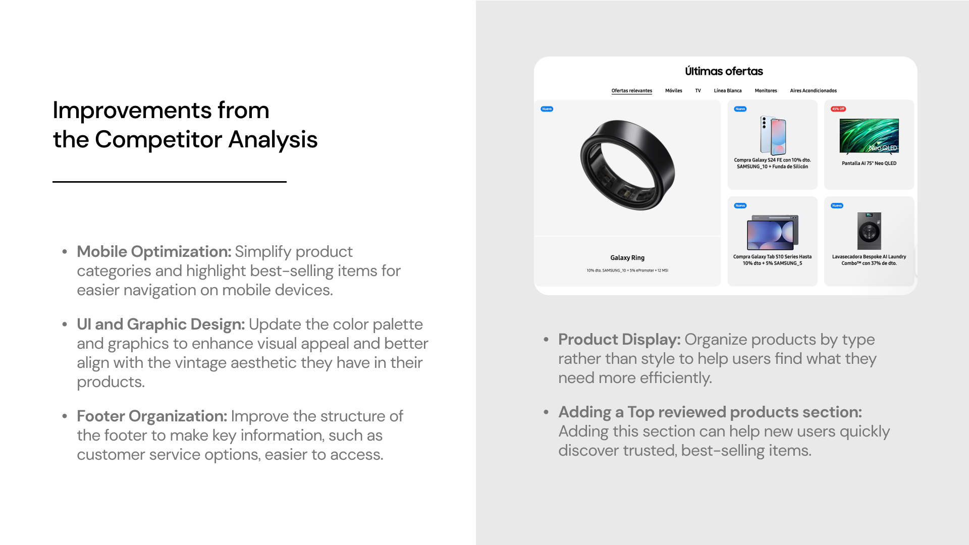

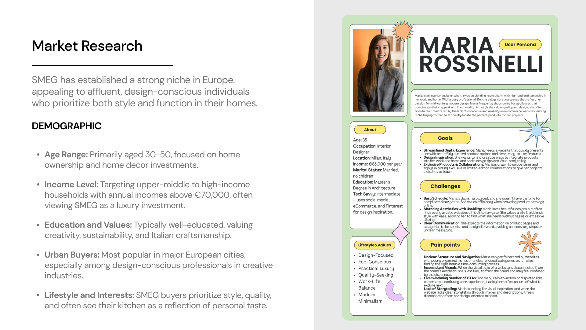
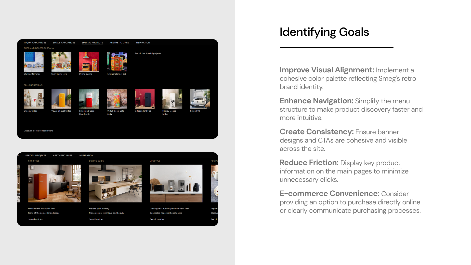
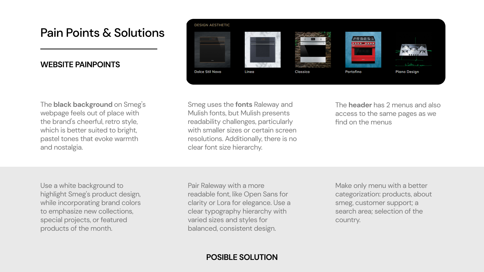
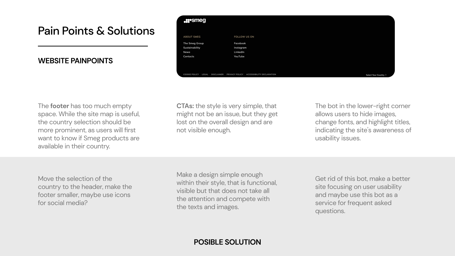
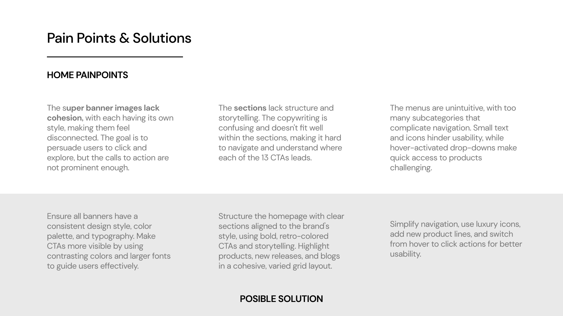
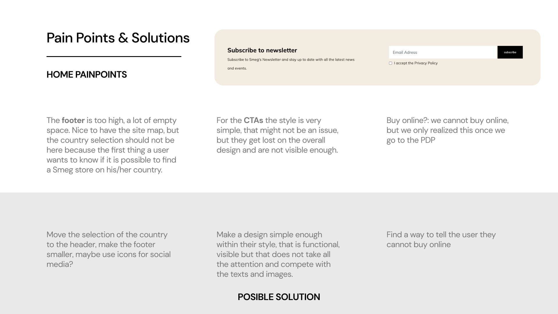

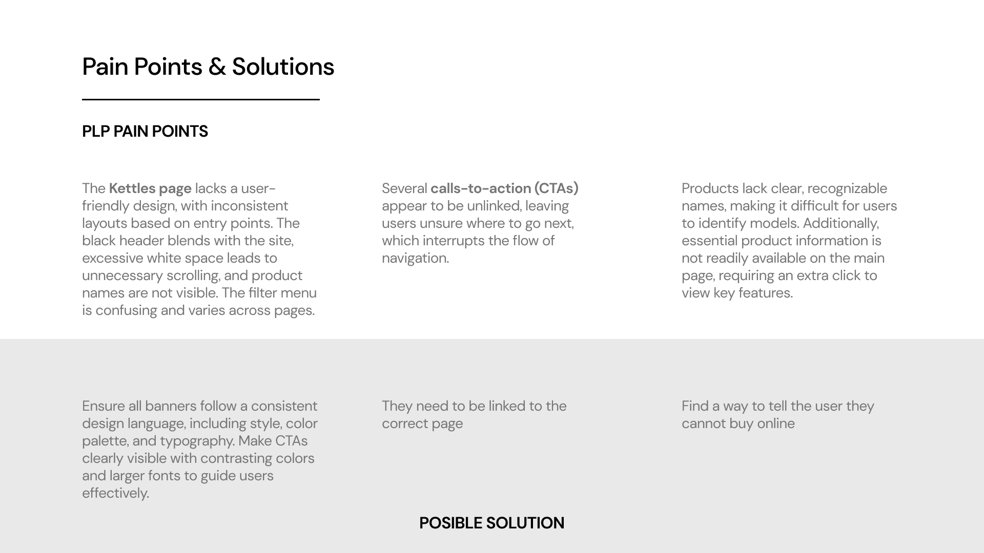
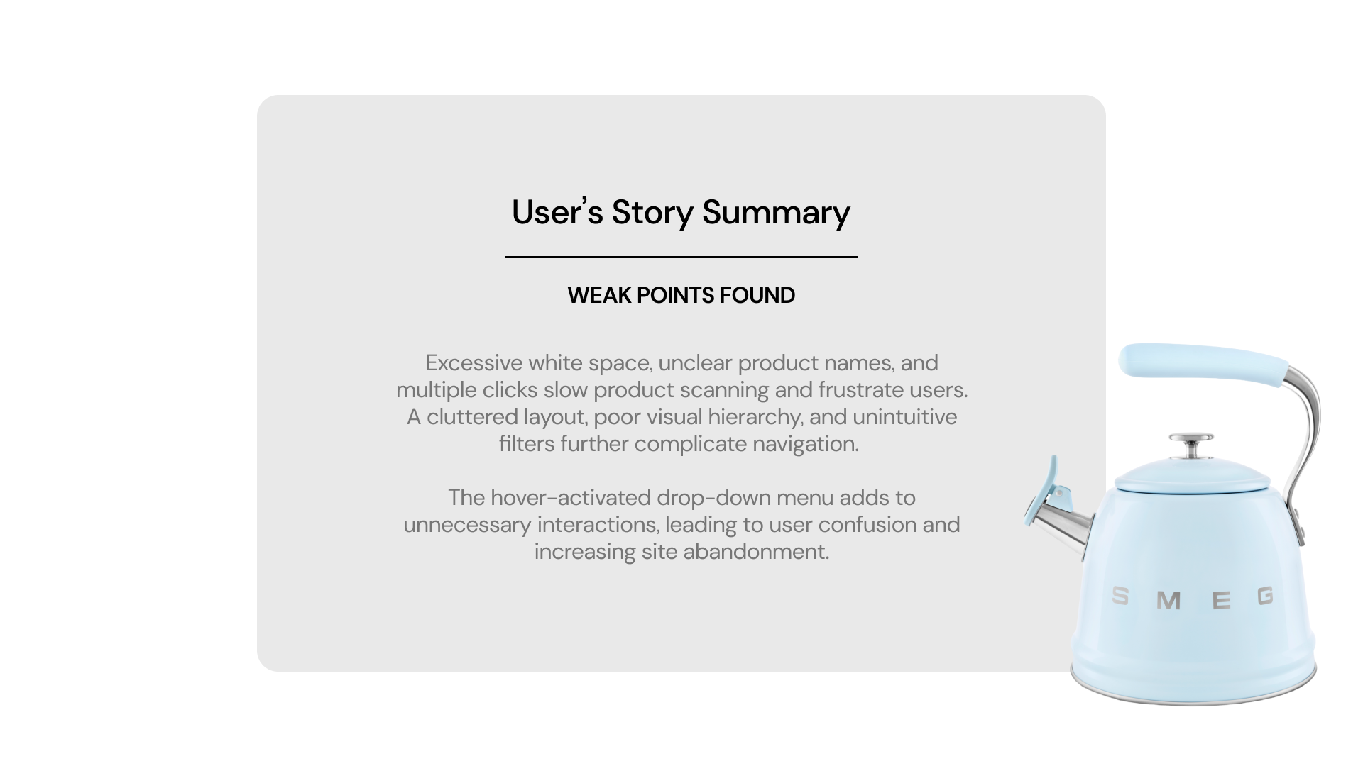
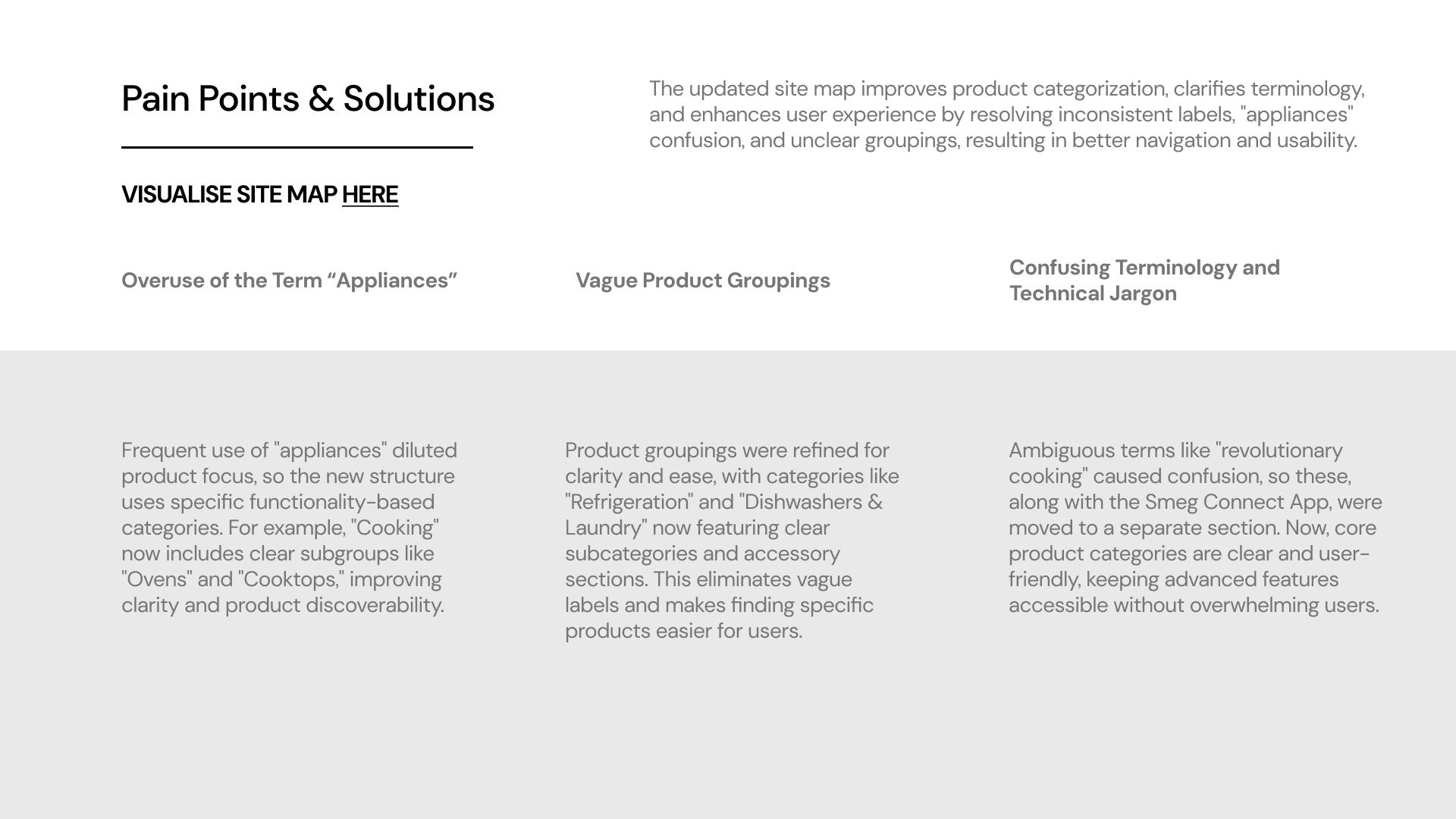
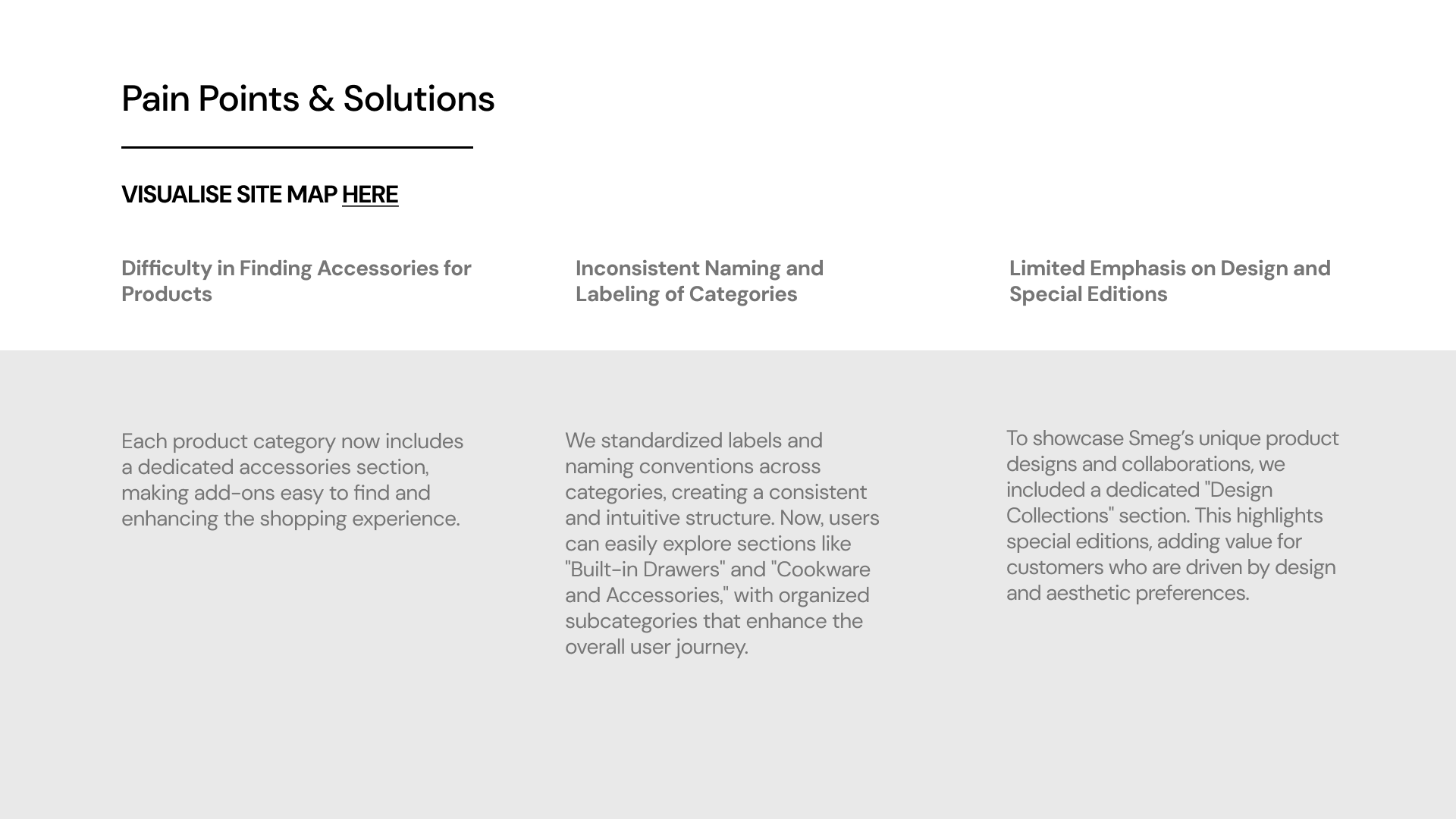
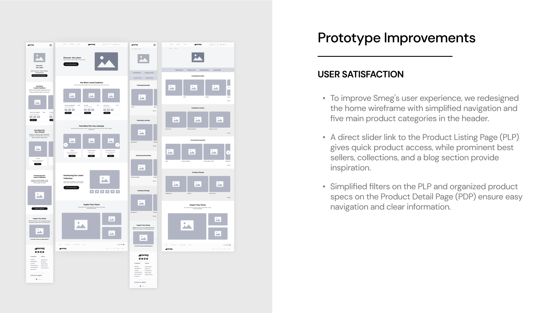
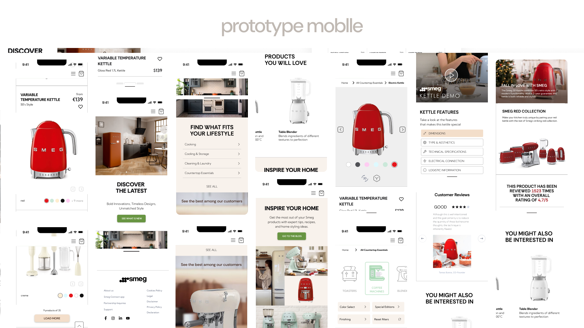
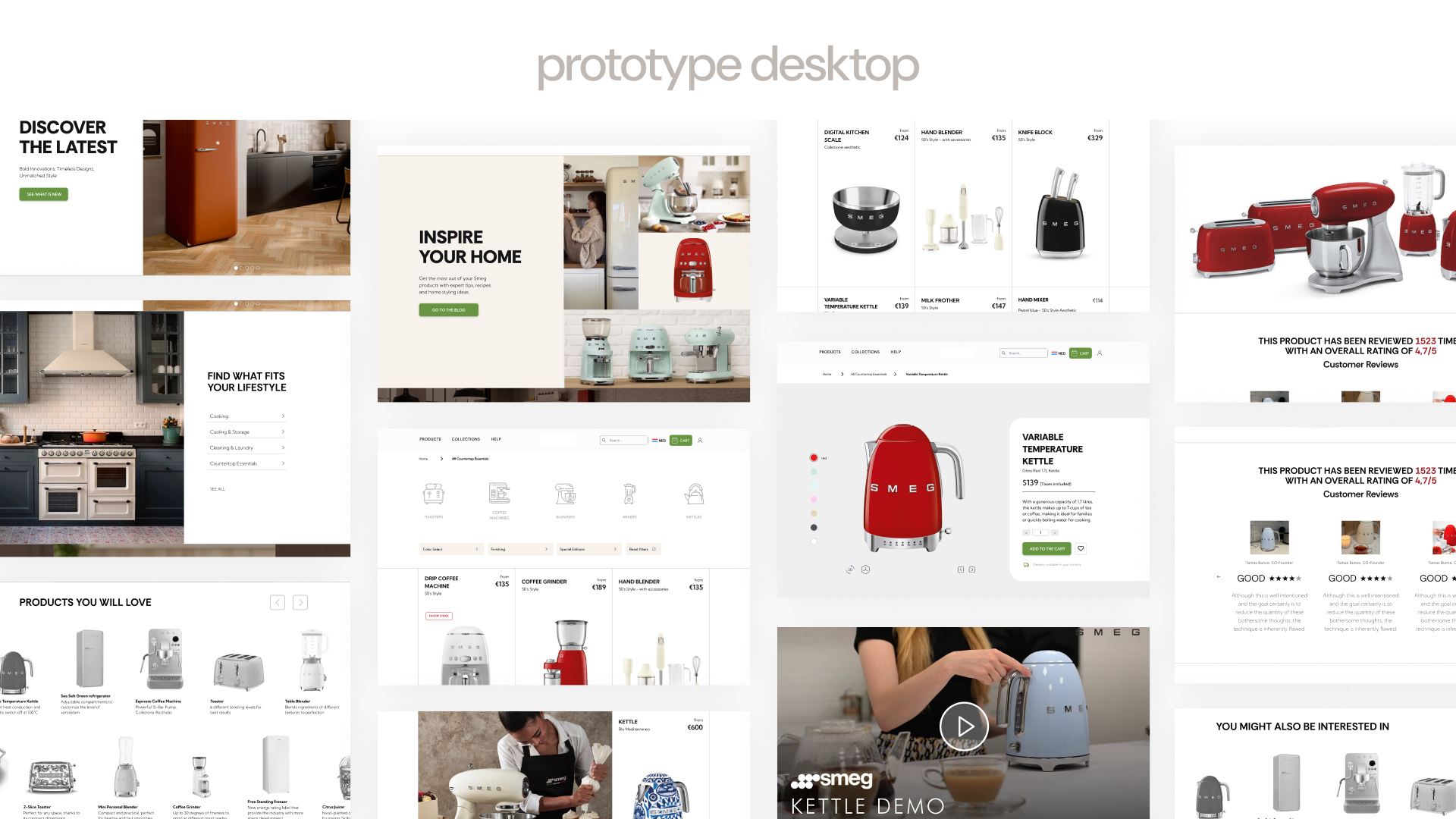

Browsing for a beautifully designed kitchen appliance should feel inspiring—but on Smeg’s website, it often becomes a challenge. Despite the brand’s strong identity and iconic retro products, the digital experience falls short, with confusing navigation and disorganized content making it difficult for users to explore and connect with the product range. This case study began with a simple question: how can the online experience better reflect the elegance and clarity of the brand itself? Through user research and competitor analysis, I examined how people interact with the site, where they struggle, and what leading competitors are doing differently. The outcome is a set of actionable insights and design recommendations aimed at improving usability, strengthening visual consistency, and creating a more intuitive and engaging experience across both desktop and mobile.